


Overview
The Planning Commission produces demographic and economic data in raw form for use within the agency’s plans and models. If requested, the Planning Commission provides demographic and economic analysis to individuals and organizations in Hillsborough County. For questions or comments kindly contact economist Yassert Gonzalez at 813-582-7356.
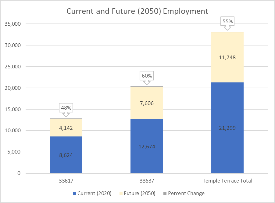
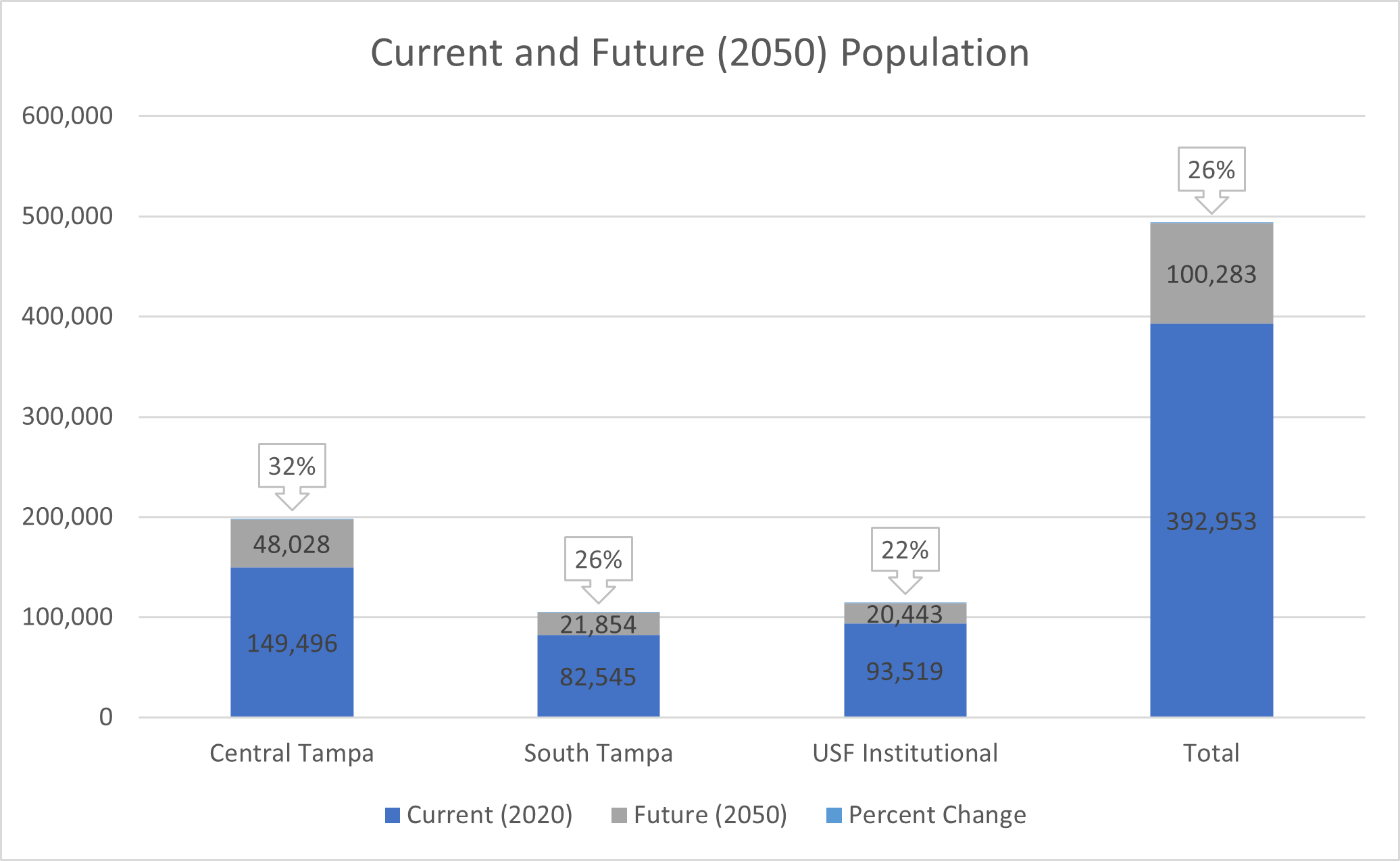
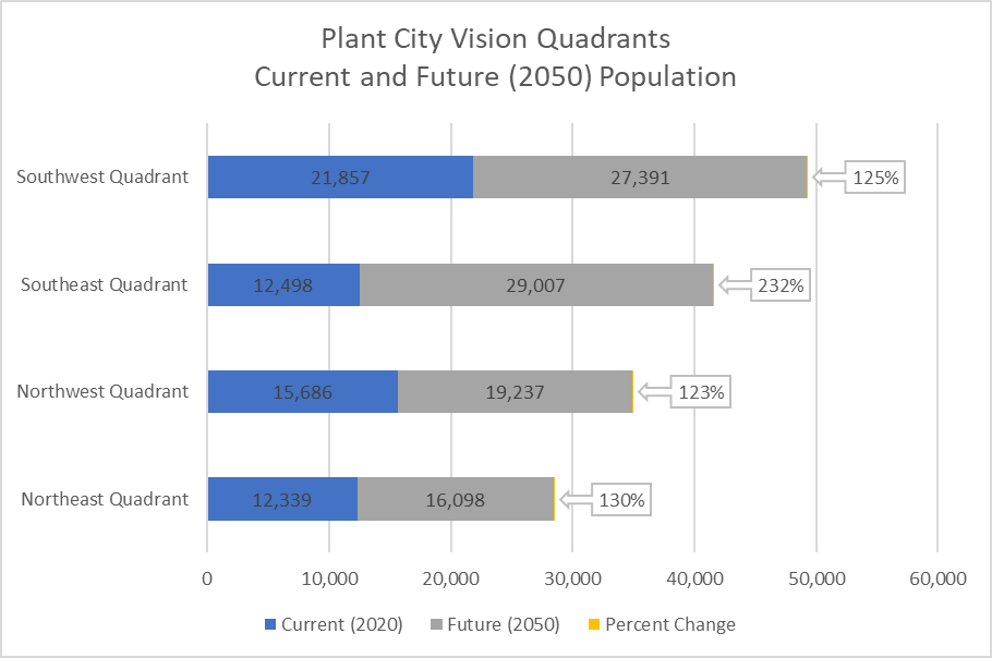
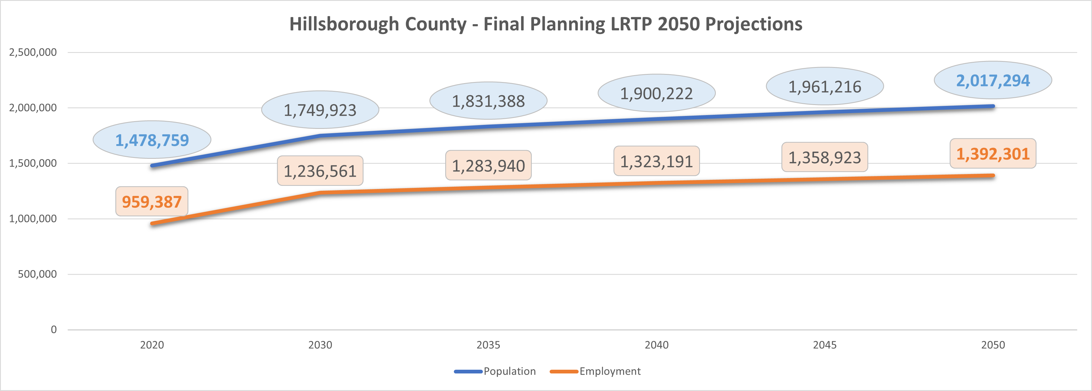
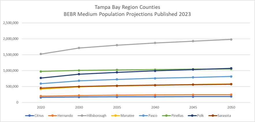
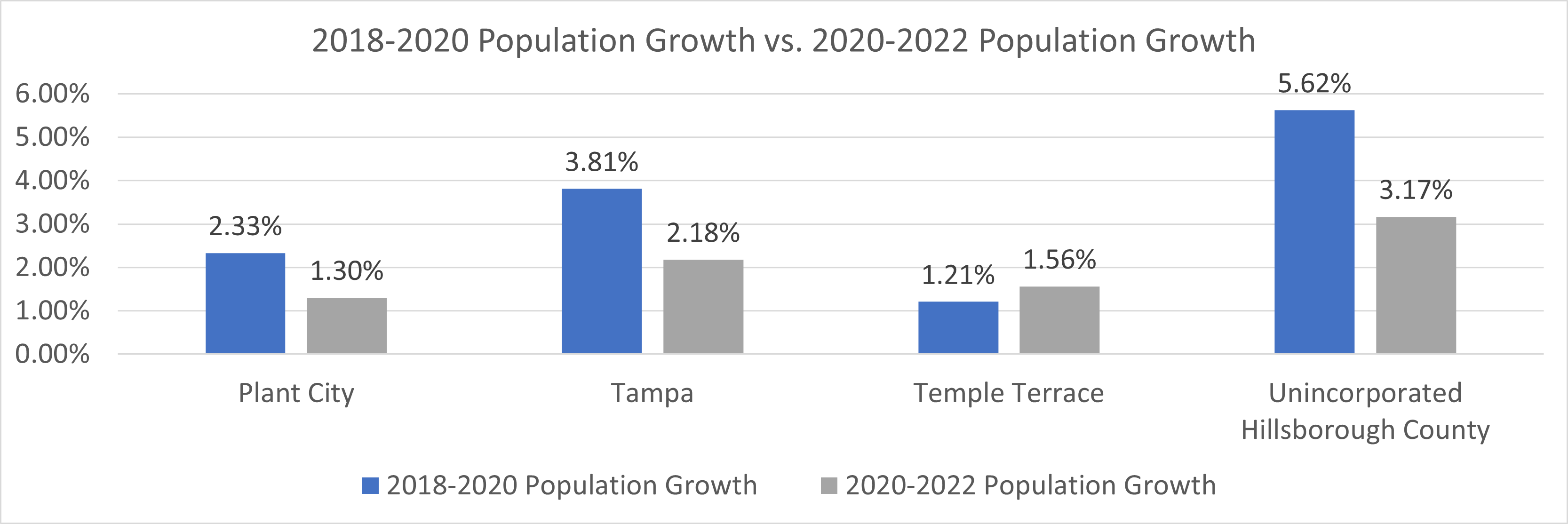
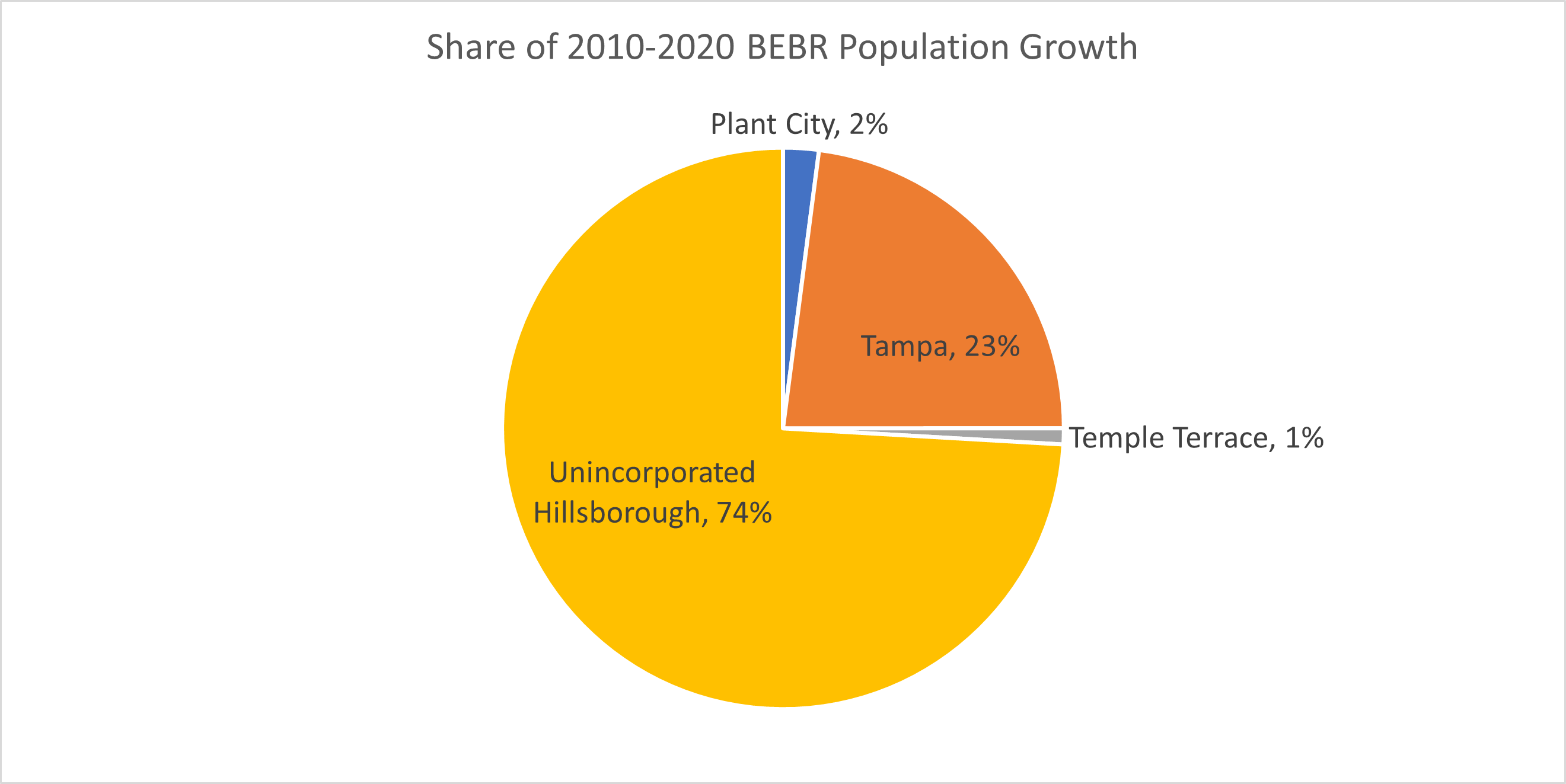
The Planning Commission routinely generates demographic and economic profiles for all and sundry geographic boundaries (e.g., cities, unincorporated areas, ZIP Codes) within Hillsborough County. These comprehensive profiles include estimates and projections for dozens of data elements (e.g., housing units, population, employment, building permits, race/ethnicity, educational levels). Click on the links below for details:
Alternatively, the Planning Commission has prepared interactive maps and dashboards for users to access new building and demolition permits:
- New Nonresidential Building Permits Issued (2020-2024)
- New Demolition Permits Issued (2020-2024)
- New Residential Building Permits Issued (2020-2024)
If studying development trends, in addition to permits issued, it would be prudent to look at newly built parcels as well:
The Planning Commission recently concluded its Nondiscrimination and Equity Plan. For more information, please email or call Connor MacDonald at [email protected] or call (813) 946-5334.
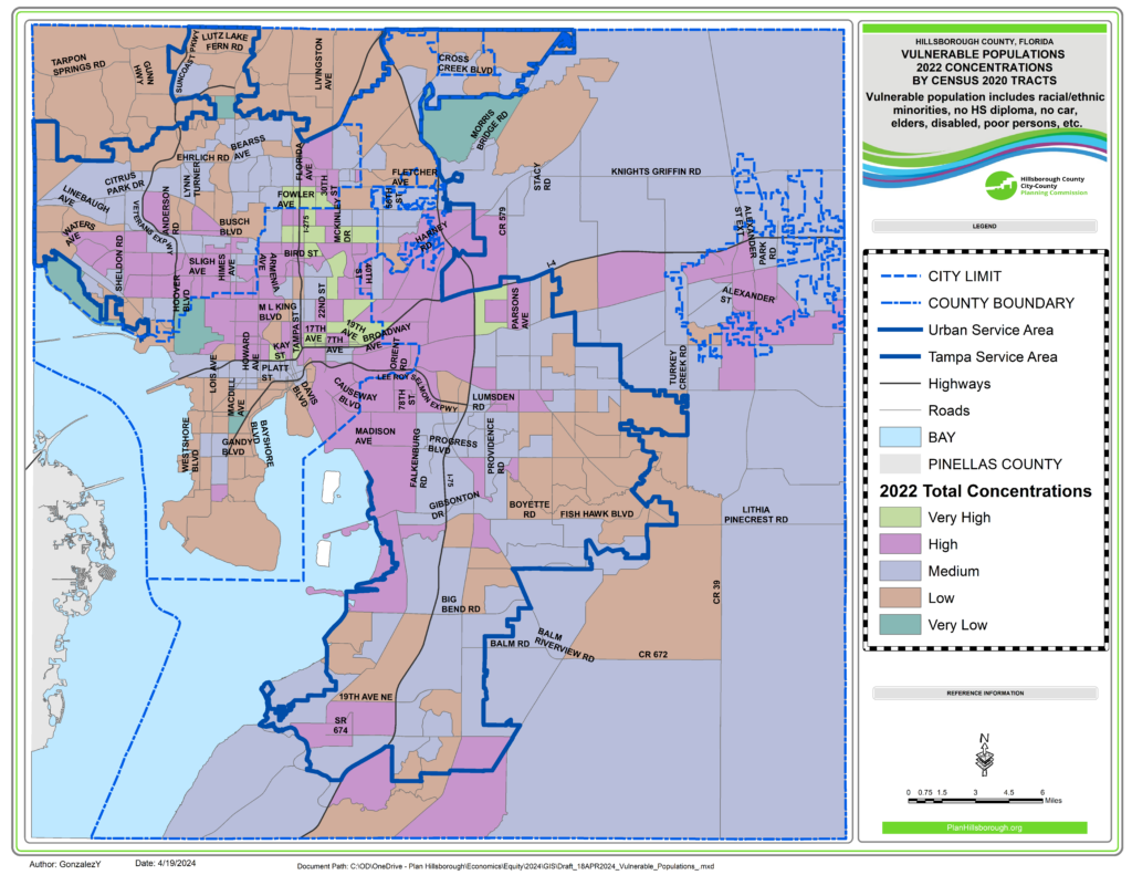
As part of the plan implementation efforts, we are currently tracking equity and inclusion metrics by various geographies. Web Scenes are interactive maps that help user to visualize the location of vulnerable populations in Hillsborough County. For instance, a user may click on a Census 2020 Tract to see the concentrations of elderly residents, limited English Speakers, persons with a disability, or households without vehicles. Click on the map below to access the web scenes for vulnerable population concentrations by Census 2020 Tract for periods 2010, 2017, and 2022.
We also have created dashboards where we would be tracking changes across time. For example, a user can find out whether the population of Limited English Speakers in Plant City is higher than 2015 or, for ZIP Code 33510, whether the percent households without cars is lower than in 2015.

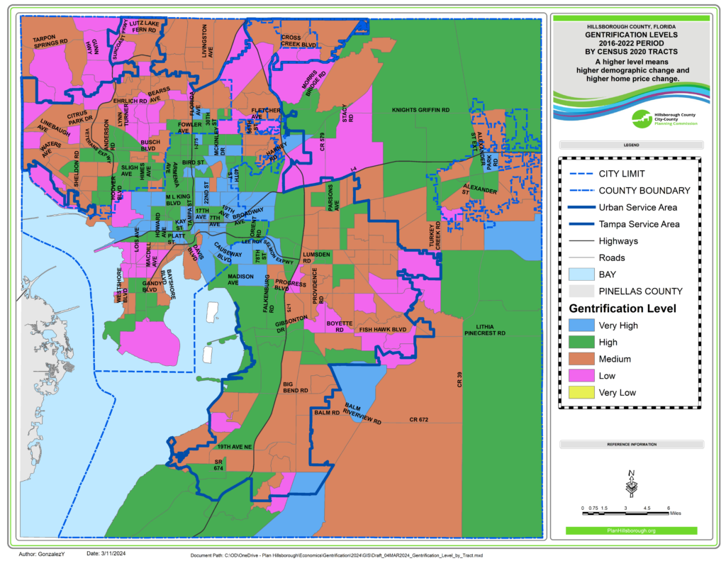
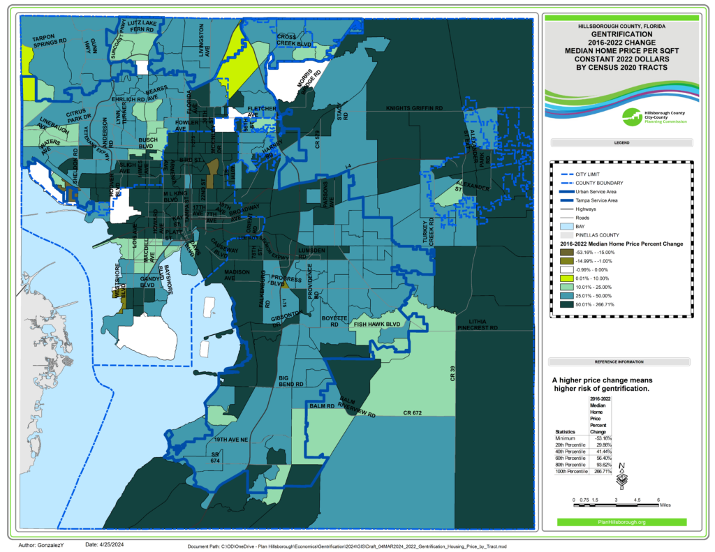
Gentrification Trends by Census Tracts
Gentrification is a perennial concern for planners and policymakers. Historically, it has been associated with densely populated urban working-level areas. Nonetheless, it can also happen in rural environments. We reviewed several methodologies for identifying areas where gentrification may be occurring. Here we present indicators of gentrification in Hillsborough County by Census 2020 Tract.
Per the Uprooted Project, we classified Census Tracts by vulnerability to gentrification, demographic change, and change in home prices. Census Tracts showing High or Very High demographic change and changes in the median home prices would be expected to be undergoing the highest levels of gentrification.
For more technical details:
Resources:
- Nondiscrimination and Equity Plan
- Housing Element of unincorporated Hillsborough County’s Compreshensive Plan
- Housing Section of City of Tampa’s Comprehensive Plan
Click on the map to view gentrification trends in your local area:
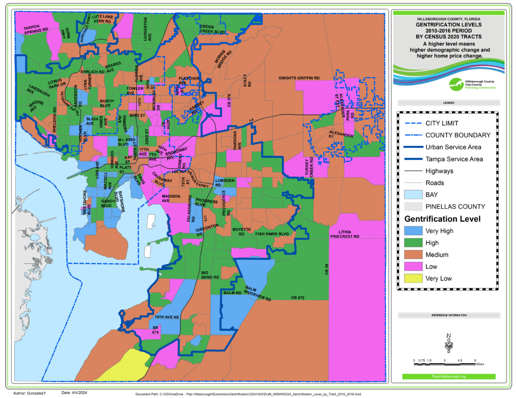
Click on map below for a historical perspective on gentrification levels by Census 2020 Tract. The GIS application includes a map of 2010-2016 gentrification levels for Census 2020 Tracts:
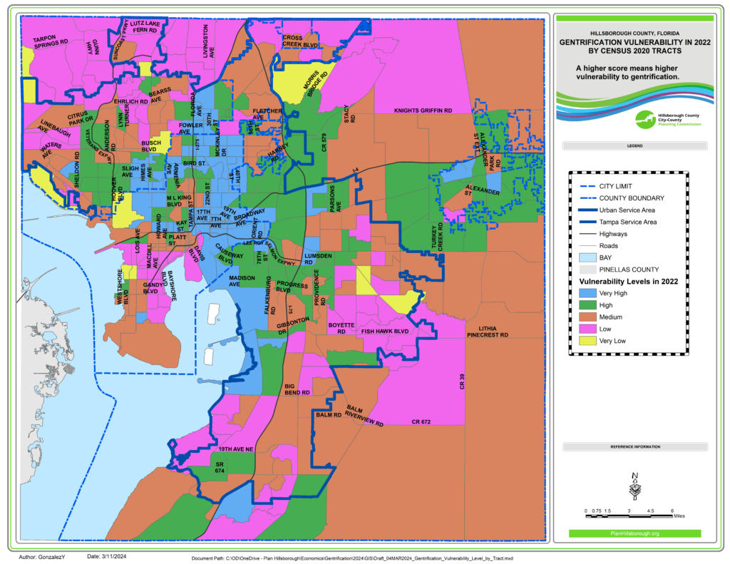
Click on the map below to view 2010, 2016, and 2022 Gentrification Vulnerability by Census 2020 Tracts:
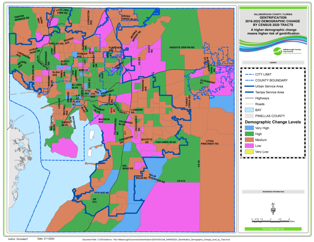
Click on the map below to see 2010-2016 vs. 2016-2022 Demographic Change by Census 2020 Tracts:
Click on the map below to see 2010-2016 vs. 2016-2022 change in median price per residential square foot by Census 2020 Tracts:
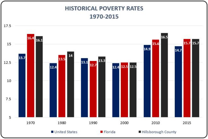
The Concentrations of Poverty: 1970-2018 provides an overview of poverty in Hillsborough County both with respect to how poverty thresholds are defined and where the impoverished live in the county. The report incorporates nearly 50 years of Census data to trace spatial changes over time. The Concentrations of Poverty report is available as a download or as an interactive story-map.
Concentrations of Poverty
Hillsborough County: 1970-2018
Terry Eagan
June 10, 2020
Introduction

Concentrations of Poverty: 1970-2018 provides an overview of Census and poverty data in Hillsborough County. While this storymap addresses the entirety of Hillsborough County, the primary focus is on downtown Tampa (the urban core) and the University Area. These densely populated areas have historically had the largest concentrations of poverty.
The focus of this storymap is to answer the question: To what extent does Hillsborough County mirror the nation with respect to where the poor live? Poverty researchers measure poverty both at the income level (how much money is earned) and spatial level (where do the poor live). Where the poor are concentrated in a high density neighborhood, the area is defined as an area of concentrated poverty. The analysis in this report occurs at the local level and “neighborhood” is used synonymously with “Census Tract”.
Current research suggests a period of time, from approximately 1970 to 1990, where poverty was concentrated in urban cores. Beginning around the year 2000, the concentration of poverty dispersed outwards towards the suburbs. The Great Recession accelerated this dispersion and increased the numbers of those in poverty, finding them located away from the urban core. The analysis in this report shows that while the number in poverty has decreased, the spatial dispersion of the poor remains.
Poverty Calculated
One way to represent poverty is as a ratio. This is simply expressed as the ratio between a family’s income divided by their poverty threshold. The difference in dollars between family income and the family’s poverty threshold is called the Income Deficit (for families in poverty) or Income Surplus (for families above poverty).
The poverty thresholds are represented in Table 1: Federal Poverty Thresholds. This is a 48-cell matrix of household characteristics based on household composition and related children. The poverty thresholds are updated annually for inflation using the Consumer Price Index (CPI-U). To determine poverty status, the size of the family unit and the number of related children or the size of the household are identified.
")
For example, a family with two adults and two children would be in poverty if the household earned less than $25,926. This amount, defined as Money Income, does not include capital gains or losses, non-cash benefits or tax credits. The total amount includes only income that is pre-taxed.
The United States agency that defines poverty is the United States Census Bureau. Each year the Census Bureau incorporates information from the Annual Social and Economic Supplement (ASEC) and the Current Population Survey (CPS) to create these poverty thresholds. Once these thresholds have been published, the United States Department of Health and Human Services (HHS) issues poverty guidelines. These guidelines are simplified versions of the poverty thresholds.
It is important for researchers to distinguish between poverty thresholds and poverty guidelines, when analyzing poverty data. Because they are not interchangeable, conflating the terms can problematize an analysis. Poverty thresholds are the definitive measure for determining who is or is not in poverty. Poverty guidelines determine who is eligible to participate in federal programs. Poverty thresholds are for statistical purposes, and poverty guidelines are for administrative purposes. A poverty analysis may include both sets of data, but guidelines are more general in nature.
A further way of conceptualizing poverty is to categorize households based on their income level in relation to the poverty thresholds. This is an analysis the Federal Government performs and defines three specific categories of poverty: 1) In Poverty, 2) Near Poverty, and 3) Deep Poverty. Furthermore, researchers Kathryn Edin and H. Luke Shaefer have proposed an additional category of 0.25 or Extreme Poverty for those surviving on $2.00 or less a day. For example, a family of four, in extreme poverty, would have an annual income between $6,085 and $12,648. In the video below, Kathryn Edin discusses the findings of her research on families who live on $2.00 or less a day.
1.5 million Americans are living on less than $2 per day
Enjoy the videos and music you love, upload original content, and share it all with friends, family, and the world on YouTube.
https://www.youtube.com/
Measuring Poverty at the Neighborhood Level
The poverty-to-income ratio is a useful metric to analyze poverty trends. However, this report is a spatial analysis of poverty distribution and the analysis derives its value from identifying neighborhoods where over 40% of the residents are in poverty. Throughout the analysis that follows, this report follows the methodology and analysis described by Paul Jargowsky, in several publications, where he addresses Concentrations of Poverty. The term, concentration of poverty, refers to the geographic concentration of residents where the poverty rate is greater than 40%. As he states in the Appendix to his Architecture of Segregation
In most studies of segregation and concentration of poverty, census tracts serve as proxies for neighborhoods. These are small, relatively homogenous geographic areas created by the U.S. Census Bureau. The boundaries of these areas follow natural and manmade boundaries such as rivers, railroad tracks, and major streets and they are adjusted from time to time as the population grows or shrinks. Nationally, there are about 72,000 census tracts included, with a mean population of 4,200 and a standard deviation of 2,000. Census tracts are designated as high-poverty neighborhoods if 40 percent or more of the residents are poor according the federal poverty threshold.
Currently, a family of four is considered poor if its family income is less than about $24,000. The concentration of poverty is defined as the percentage of an area’s poor population that lives in high-poverty neighborhoods (that is, census tracts). The area could be a county, metropolitan area, state, or the nation as a whole (Jargowsky 2015).
Poverty Results from the Decennial Census
In 1970, the percentage of Hillsborough County residents in poverty was 15.8% or 77,215 persons. The areas of concentrated poverty were all within the City of Tampa except for one located in the City of Plant City. Of the 10 neighborhoods where poverty was concentrated, they accounted for 22% of the total number of persons in poverty or 16,931 people. All but two neighborhoods were in downtown Tampa, the exceptions being the one in Plant City and one in Tampa Heights.
By 1980, the percentage of County residents in poverty had decreased to 14.2% or 87,921 persons. By this time, the areas of concentrated poverty were all within the City of Tampa. The decrease in poverty resulted in these areas accounting for 19% of the total population or 16,487 persons. Once again, except for the tract in Tampa Heights, the entirety of concentrated poverty was in downtown Tampa.
The 1990 Census showed that poverty remained concentrated in the downtown area. Although the percentage of people in poverty was 13.3% (or 108,744 persons) countywide, the area of concentrated poverty had a poverty rate of 15% and represented 15,822 persons. The total population in these neighborhoods accounted for 30,065 persons so over half lived in poverty. To put it another way, 15% of the poor population in Hillsborough County lived in only nine neighborhoods.
The 2000 Census portrayed a changing picture. The number of neighborhoods decreased from ten to seven. The Tampa Heights neighborhood (Tract 12) disappeared from the map albeit a new tract (7) appeared on the map. This was the site of a new public housing. In 2000, the poverty rate was 12.5% (or 122,872 persons) countywide. Of the population in poverty, 9% lived in seven Census Tracts and accounted for 10,253 persons in poverty.
Poverty Results from the American Community Survey
Measuring poverty for the year 2010 becomes problematic because the 2010 Census did not ask income questions. To ascertain the poverty concentration in 2010, we utilized two separate ACS products. The 2010-2014 ACS has the year 2010 as the beginning year. Staff included the 2014-2018 ACS as a follow-up tool to gauge any changes to poverty concentrations.
The percent of the population below the poverty level in 2010 to 2014 was 17.2% or 216,127 persons. The dataset for 2014 to 2018 showed a decrease of the population in poverty by 1.9% (15.3) at 207,962 persons. The neighborhoods of poverty expanded outwards from downtown Tampa. This matches the trend found throughout the nation and reported in research. The decline in concentrated poverty from ten tracts in both the 1980 and 1990 Censuses to seven in the 2000 Census was reversed.
In the 2010-2014 ACS, there were 22 tracts with concentrations of poverty. Discounting those with a high margin-of-error still leaves nine tracts, four in or adjacent to downtown Tampa and another four comprising a new core of poverty near the University of South Florida. Comparing these tracts against the most recent ACS data for 2014-2018 reveals many of these tracts are no longer in poverty.
Although the 2014-2018 ACS reveals a spatial change in concentrated poverty, there remains one tract (136.04) that retains its high poverty level. This tract is notable because it extends south into the Palm River and Riverview area of Unincorporated Hillsborough County. While the number of tracts in or adjacent to the University Area has declined from seven to four, the University Area remains a high poverty concentration.
Conclusion
From the 1970s to the 2000s, the poverty rate remained relatively consistent in Hillsborough County. Beginning in the 2000’s, but before the recession began, a population shift was underway from the downtown core to the University Area. Neighborhoods of poverty began to shift from one urban and employment location to another location. Or, the number of persons in poverty increased so drastically that they occupied two urban centers. Residents of downtown Tampa exchanged addresses for new ones in the University area.
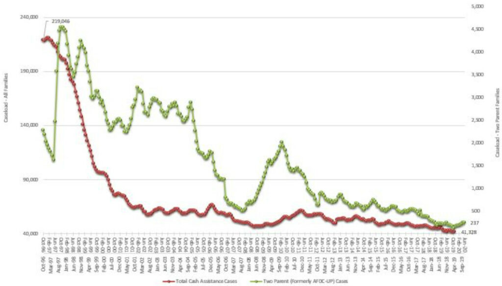
The change in location from one area to another may be explained by a number of different dynamics: gentrification, residential demolitions, and geographic relocation. Two national trends could be seen to accelerate this process – the welfare reforms in the mid 1990s and the Great Recession.
The Welfare Reform Act of 1996 (The Personal Responsibility and Work Opportunity Reconciliation Act of 1996) led to many changes in the provision of welfare and cash assistance. The primary effect led to the creation of the Temporary Assistance of Needy Families (TANF). Initially founded with 16.5 billion dollars in funds, TANF was to be distributed through block grants. However, there are no requirements for states to provide the funds to families in need. Rather, these block grants have served as a stop-gap measure for states to fill holes in their budgets. Likewise, the original funded amount of 16.5 billion dollars has never been increased to match population growth. The allocation was 16.5 billion dollars in 1996 and over 25 years later remains 16.5 billion dollars
The chart below illustrates the precipitous decline in providing aid to families in need.
Gentrification
Gentrification, the replacement of an existing neighborhood’s residents and character by wealthier and more educated arrivals, is one of the most difficult characteristics of modern life to identify. For some analysts, gentrification reflects a positive feature in the revitalization of urban cores. Others view gentrification with suspicion as it often accompanies changing price-points and the loss of a region’s affordable housing (among other things). This storymap takes no position, positive or negative, regarding gentrification. It is only addressed as one feature among many that may affect concentrations of poverty.
Gentrification may be one of the causes shifting neighborhoods of poverty away from downtown and north into the University area. Staff drew this conclusion after evaluating myriad models of gentrification and settling on the methodology used by the City of Portland’s Planning Department. They created a Gentrification and Displacement Study which is easily repeatable using Census data. Portland’s Methodology for Vulnerability Risk Analysis identifies neighborhoods (e.g. Census Tracts) at risk for gentrification by assigning a vulnerability score. The vulnerability score ranges between 0 (minimal risk for gentrification) and 4 (highest risk for gentrification). The following table details the risk factors, the evaluation criteria and the scoring method.
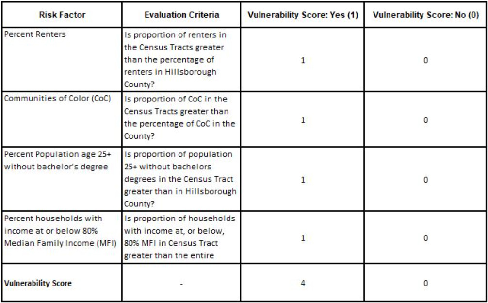
Evaluating the downtown neighborhoods of poverty, almost all of them have a ranking of 3. Many residents live in rental properties and/or subsidized housing and these neighbor-hoods are primarily African-American. An interesting feature of this analysis is that both downtown and the University area are similar in their rankings. Both are urban centers, both are in, or adjacent to, high-wage employment centers and both have a high number of rental units.
Historical Redlining
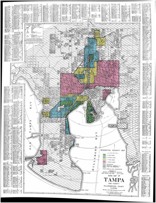
Redlining refers to the practice of the government, banks and other lending institutions assigning a “high risk” label to geographic areas. This process began in the 1930’s as part of the New Deal. The Home Ownership Loan Corporation (HOLC) prepared a series of maps entitled, Residential Security Maps. These maps assigned a color-coded grade of A-D to geographic areas of a city. An “A” and a “B” (green and blue, respectively) were assigned to areas that were either good or still desirable. On the other hand, areas with “C” or “D” (yellow and red, respectively) were areas that either were definitely declining or hazardous.
In the City of Tampa, hazardous areas were defined by the presence of Blacks, Latins or Jews — their terminology. The result of this practice were discriminatory lending practices whereby many residents in these communities could not receive mortgages or loans. In the event loans were available, these were often offered at terms unfavorable compared to residents in other areas of the City of Tampa.
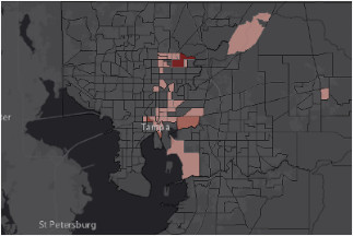
While the maps were created roughly 80 years ago (and redlining was outlawed approximately 50 years ago), the effect on property values continues. The average property value per acre for each of the four areas is: A (Green) – $2,674,426; B (Blue) – $1,743,677; C (Yellow) – $1,153,597; D (Red) – $668,500. The map below provides a spatial representation of the assessed value by acre.
Relocations

The University area has an ample supply of rental housing due to its proximity to the University of South Florida campus as well as a large number of students living here. Over time, it appears that the University area has become an area of relocation for persons of limited means. As opportunities for inexpensive rent and affordable housing have winnowed over time and/or policy makers have chosen to eliminate or close subsidized units, the University area has become an even greater draw for those with little resources.
At this time, it is difficult to determine how many of those living in the University Area moved there after the closing of North Boulevard Homes in 2015. As part of the 2017 City of Tampa Redistricting, staff were able to track approximately 1,700 former residents of North Boulevard homes. Of the approximately 1,780 residents, 1,100 residents have relocated within other high poverty neighborhoods in the City of Tampa. We identified only 74 that relocated in the University Area.
Demolitions
Of the number of homes demolished since 2011, 1,055 units have been demolished either in the 13 tracts or within a vicinity of 5,000 feet of any one tract. The relationship between demolitions and concentrations of poverty remains tentative. It could be that aggressive code-enforcement led to accelerations in the number of demolitions, further forcing those in poverty into other locales.
A comparison was made between the concentrations of new construction and concentrations of demolitions. This preliminary analysis appears to show a spatial mismatch between the two types of real estate activity. New construction appears to be driven by the Water Street Project in downtown Tampa, the West River Development on the side of the former-North Boulevard Homes in West Tampa, and tear downs and replacements of residential properties throughout east and south Tampa. On the other hand, while demolitions are seen to cluster in many parts of the City, when compared to the spatial location of new construction, it appears that East Tampa is dominated primarily by demolitions without corresponding replacement of housing stock.
Eviction Data
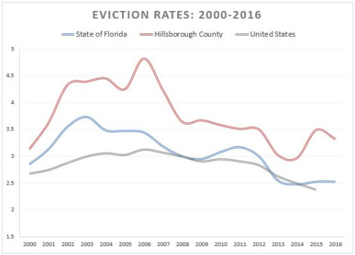
Eviction data provides another level of insight into neighborhood changes over time. The eviction trend map provided below reflects eviction rates for each of the 321 Census Tracts in Hillsborough County. Tracts that include a stippled shading are one of the 30 tracts that have been identified at some point in the 48 years of analysis.
Eviction rates are the number of evictions per 100 renter homes in an area. An eviction rate of 5% means 5 of every 100 renter homes faced eviction that year. Historically, for the years between 2000-2016, the eviction rate for Hillsborough County was higher than the state or national eviction rate.
Among the Census Tracts considered below, some had triple or quadruple the national eviction rate for any one year. While not all areas of high eviction rates were in areas of concentrated poverty, areas of concentrated poverty did seem to be in areas with high eviction rates. The use of eviction rate data can be a useful tool in addressing those areas that may not meet the poverty threshold in the ACS data.
Final Thoughts
Staff recommends to continue monitoring concentrations of poverty, eviction data along with the gentrification risk factor criteria. Staff will also be keeping relevant policy making bodies apprised as to how planning and development initiatives impact these vulnerable communities.
References
Sources and additional reading
Longitudinal Tract Database
Logan, John R., Zengwang Xu, and Brian J. Stults. 2014. “Interpolating US Decennial Census Tract Data from as Early as 1970 to 2010: A Longitudinal Tract Database” The Professional Geographer 66(3): 412–420
2000-2016 Eviction Data
This research uses data from The Eviction Lab at Princeton University, a project directed by Matthew Desmond and designed by Ashley Gromis, Lavar Edmonds, James Hendrickson, Katie Krywokulski, Lillian Leung, and Adam Porton. The Eviction Lab is funded by the JPB, Gates, and Ford Foundations as well as the Chan Zuckerberg Initiative. More information is found at evictionlab.org.
Redlining Data
Robert K. Nelson and Edward L. Ayers, accessed April 6, 2020, https://dsl.richmond.edu/panorama/redlining/Tampa
Jargowsky, Paul
“Architecture of Segregation: Civil nrest, the Concentration of Poverty, and Public Policy. TCF.org https://tcf.org/content/report/architecture-of-segregation/
State of Florida Caseload Data on Food, Medical Assistance and Cash
http://www.dcf.state.fl.us/programs/access/StandardDataReports.asp